#Color grading for cinematic look
Explore tagged Tumblr posts
Visit Tumblr Blog
Explore Tumblr blogs with no restrictions, modern design and the best experience.
Last Seen Tumblr Blogs


Fun Fact
In 2020, 44% of users from Denmark used Tumblr daily.
Text
BRAWLER - Martial Arts Action Film 4K Teaser Trailer
I’m excited to reveal the official teaser trailer for “BRAWLER”, a kick ass martial arts action film directed by Bulent Ozdemir-Larusso with action direction/coordination by Lukaz Leong. Get a special 10% discount at dehancer.com using the code: BOZ10 Synopsis: A focused fighter risks everything in a high-stakes brawl to save the one he loves. Bad ass martial arts choreography ✅ Bone…
#4k trailer#action#behind the scenes#blackmagic 2383 lut#blackmagic braw to rec709 lut#bulent ozdemir larusso#cinematographer#color grade#Color Grading#colorist#davinci resolve#fall guy trailer#film look#film production#filmmaker#filmmaking#full frame camera#halime ozdemir larusso#imdb#isky fay#lukaz leong#lumix s5 cinematic#martial arts#martial arts movies#panasonic s5#Short Film#video editor
0 notes
Text
4 Minutes and the Cinematography of Nipples
I said before that I thought 4 Minutes was pretty instantaneously the best looking BL on the market for 2024 after one episode. Which, not gonna lie, is a pretty big fucking claim. There’s been a lot of BL that’s come out that’s looked good, and I do think there’s been a steady improvement overall in the market in the last few years. Personally I think Japanese and Korean BL have a stronger production quality over a majority of Thai BL but like, if that’s a hot take I guess I prefer my food spicy.
The point being~ if I’m gonna make such a hyperbolic statement, well I better back it up right?
So I’m gonna break down a few scenes from the first episode, what I liked about them, why they worked for me, and why on a technical level I think 4 Minutes has just got it going on.
For better readability you can also check out this essay here.
Sidenote: my google docs kept trying to autocorrect “Bible” to “the Bible” and idk how to teach google I mean the hot Thai actor and not the book of Jesus.
To start, I’m going to break down this scene featuring Great and his nepo baby cat:
I thought starting with this scene would be good because it’s such a low-key scene and honestly making these simplistic scenes visually interesting is very difficult! But if you have the basics down, the foundations of cinematography and film making, these simpler scenes can be really memorable.
Like yeah we’re all gonna remember this scene because shirtless Bible and oh my god Akira!? - I have only recently learned who Akira is; why is this cat getting a bigger bag than me? - but beyond that, what makes it cool to watch? What makes it interesting? What information does it showcase to the audience?
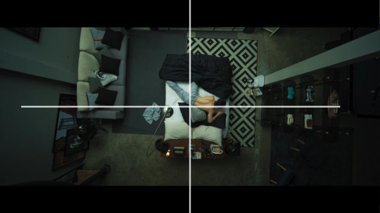
One thing I added to the video was a grid for the rule of thirds.
Rule of thirds is a shot composition technique applied to both film and photography. It’s the grid you see if you film a homevideo and helps a Director and Cinematographer figure out where to place the subject or subjects of the shot. The idea is the gridlines show you where you “should” place the subject(s) of said shot.
Like everything, the rule of thirds is a guideline in filmmaking, not a hard and fast unbreakable rule. Filmmakers like Wes Anderson like to play more with central composition shots, rather than ROT.
Anyway on to the opening shot, right after our credits and we’re moving into the shot.
To start, the first thing I notice is the scene’s color grading. Color grading in film is the manipulation of raw film footage to create specific color tones throughout a project. Sometimes this grading is more pointed and obvious, think The Matrix, while in other films it’s not as obvious but still very prominent, think Killers of the Flower Moon.
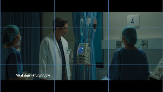
It’s not that the before credits scene looks entirely, jarringly different from the opening scene, but the hospital scene is surrounded by whites and blue tones, it’s darker, and only a single source of light exists. It gives the entire scene a much more frantic, uneasy aesthetic but it’s not so far off from the darker muted tones of the next scene that it feels jarring or out of place.
The second big thing I noticed in the episode is the use of aspect ratio. I’m not 100% sure what aspect ratio the production used exactly, but the use of widescreen as opposed to full screen in my opinion, gives the episode a more cinematic feel to it in comparison to other Thai BLs.
Example, if you look at Century of Love (2024) it appears to be filmed in the standard full screen - which I believe is 16:9? - while 4 Minutes is widescreen (thus the black bars at the top and bottom). Widescreen can give a show a more “movie like” quality to it which is part of the vibes I get from 4 Minutes.

(source)
Onto Great’s actual introduction scene.
We’re not starting the shot with static movement, but with a camera panning right. I’ve talked about camera panning and such in BL before and it’s something I’ve found doesn’t happen as often as it should. Which is a shame! It’s such a simple technique but it adds so much.
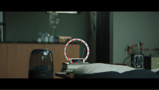
Imagine if we entered the frame with a static center shot, and then a cut to Great sleeping and turning off his alarm clock, and then another cut to above the bed. Think about how much more boring that could be visually.
Instead, we enter the scene with movement, panning over and creating some interesting visual framing.
So here’s our opening shot, do you notice anything interesting? To start, what I like about this shot other than the panning movement in, is that we don’t see Great’s face yet. In fact we don’t see his face in full until about 30 seconds into the scene. This builds anticipation, yeah we all know what Bible looks like, but for the audience who doesn’t this helps build anticipation.
Who is this character? What does he look like? What’s his deal?
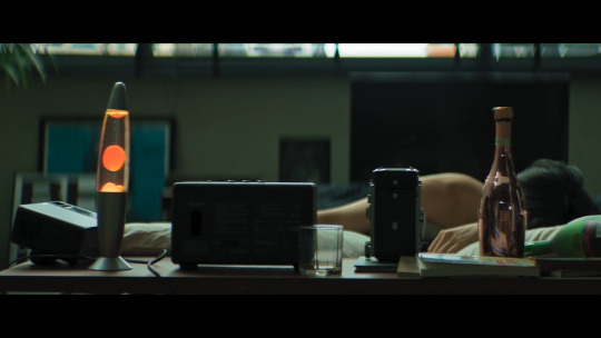
It also engages the audience more, if you notice part of the composition of the shot has Great in the mid-ground slightly blurred out, while the foreground emphasizes the things on his desk. He’s distant from us, the audience, sleeping off his hangover not yet ready to “join” the world yet.
Here’s another two more things I like about this shot:

Lines.
Using lines and shapes can make a scene more visually interesting and invoke different feelings to the viewer. In this shot, I get a sense of symmetry, the camera panning right, lightly drags across the screen alongside the lines below and above Great, almost creating a frame within a frame effect. As if Great is boxed into a clock in and of itself.
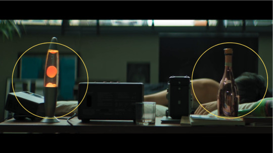
You can also see the use of balance in the scene as well, connecting back to that visual theme of symmetry as well as blocking our view of Great’s face. The lava lamb and champagne bottle are almost the same height, which helps create balance in the shot. The champagne bottle informs us Great has been drinking or does drink since it’s positioned so close to his bed, whilst also continuing to hide his face away from the viewer.
I also like that the lava lamp is a bright spot of color. The tone of the scene is mostly muted greens, and gray, but the bright orange lava lamp and even the pink champagne bottle draw our attention but don’t overwhelm us either. It provides the scene with some warmth but doesn’t offset the overall tone of the color grading.
And then, the last bit of this shot:
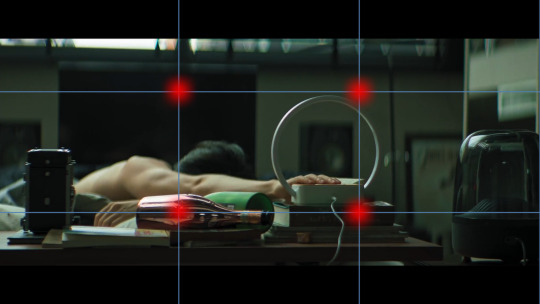
We have Great knocking over the champagne bottom, and turning off his alarm clock. Notice that the alarm clock and the champagne bottle hit those ROT dots almost exactly. There’s also the use of lines by the length of Great’s arm - I just forgot to add a line I’m a failure, a fake, fml - we see him knock over the bottle, and then we follow the line of his arm directly to the alarm clock which is also a shape, a circle.
I like that they used a clock with a specific notable shape, since by the end of this scene the clock is relevant to the story as a whole. Using a shape makes the clock more visually noticeable and memorable to the audience.
So in the next cut we’re above Great - just like Great’s gonna be above Tyme, fuckin hell I’m corny - in a medium-full shot and there’s a couple things I really like here.
I really like the use of lines here with the bed going in one direction but Great’s body going another. It’s disconcerting, and off kilter a bit.
The use of patterns plus the opposing symmetry, whereas in the previous shot the lava lamp and champagne bottle were providing balance, here one side of the bed is patterned, while the other isn’t. This creates a sense of imbalance and makes the shot more visually interesting.
This medium-full shot at a high angle makes Great smaller, and continues to showcase his dishevelment, keeping him distant from the world itself. Also notice the lack of color here as well.
What could this say about Great as a character? Or his story?

So this next cut is the one that actually inspired me to write this essay to begin with and know what I’ma eat some crow here. I originally said it was a great ROT shot but I was wrooooooong. It’s definitely a center composition shot.
Notice as well, the bed itself is its own shape - rectangle - center in the frame, and yet the shot almost looks unbalanced again because of that singular patterned rug. It’s the only pattern in the entire shot, not even Great’s pillows have noticeable patterns on them.
The above view camera angle in a full shot creates almost an omnipresent feel, as if the audience - or something else? - were looking down upon Great. Whose face we still haven’t seen! It makes him smaller, less powerful, and almost vulnerable. Shots like this are often used in horror films like James Wan’s Malignant (2021) where the horror spector will be looking down above the would-be victim.
Another thing I like about this scene though is we have Great moving. It would be simpler and easier to have his phone just by his alarm clock, or under his pillow, but think about how much more visually interesting it is that he has to move down the bed and reach for his phone. It creates action in an actionless low stakes scene.
And now, 30 whole seconds in and we’ve finally seen Great’s face!
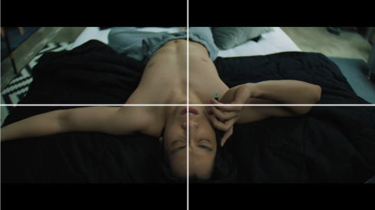
Fun fact, with the ROT grid the gridlines fall right across Bible’s nipples. That’s not a film analysis, just something I noticed entirely intentionally. Thanks Madam Director Ning Bhanbhassa Dhubthien.
The actual shot is in center composition again, as Great rolls over and reveals his face the camera begins to zoom in.
This creates movement in the scene instead of leaving the camera to statically observe it’s now, finally, inviting the audience to meet Great. Pulling us in towards him whereas before we were kept at a distance. Great’s awake and, well as ready to meet the world as somebody with a raging hangover can be.
I also like how Bible is moving constantly in this scene; he rubs his eyes and nose, he twitches his fingers, titles his head back and forth, etc it’s nothing revolutionary but it’s appreciated.
When the scene cuts, we get this shot:

I didn’t put the red dot on his nipple, it just landed there. This is all Madam Director Ning chepie.
But you can see how Great’s body is landing on all those gridlines pretty solidly. Also in the background we see his alarm clock again, a bright blurred circle in the distance. I also like the angle of this shot, as it creates depth in the frame, with Great’s head being in the foreground his lower body in the mid-ground and the background blurred out.
What follows is Akira appearing in frame. Which was really difficult to capture so I don’t have a screenshot. But what I really like is Akira entering the frame out of focus. They could have just cut to Akira, but instead they opted for Akira to enter the frame which is more interesting.
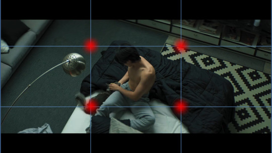
When we do cut, Akira is firmly on one of those dots so we don’t miss them in the frame. I think it’s also interesting that we’ve pulled out again, into a mid-full shot, hanging above Great, and we see that clear symmetry line again between the patterned rug and the regular carpet.
I also really love that when we got to Great sweet-talking Akira and feeding them we’re not just doing a cut, we’re panning downwards which continues to add movement to the scene. And we get that moneyed sponsor shot!

Durex can’t pay for everything okay?
So in the final bit of this scene we get focus on Great, who’s in focus, before he gets up and leaves the frame where the camera then focuses on the clock behind him.
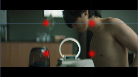
See how in the first frame the background is all blurred out, but once Great walks out of the frame - again, great that he walks out, movement!! Y’all don’t understand how boring 1000 Stars was for me to watch because of the lack of this stuff okay? - and then the focus shifts to the clock. Which is round.
God I know that sounds so dumb, but imagine the clock without that ring light bit on it, it’s just a tiny little rectangle. Not as fun or interesting to look at right? Or as noticeable especially from a distance?
This shift in focus also tells us “this is important” whatever “this” is. The subject of the shot goes from Great to the alarm clock but they are positioned as equally important. We’re meant to pay attention to this seemingly innocuous item, which we learn later in the episode is time. We’re meant to remember and note that time will be important to the story - I know with a title like 4 Minutes you’d fucking hope time would be important but have y’all ever read Youtube comments? It’s rough out there for visual comprehension okay?
So all in all this scene is only 1 minute and 40 seconds give or take. It’s very short, but I don’t think it was boring at all. I think it’s a really solid introduction to a main character. Think, Korn didn’t get this much time to showcase his introduction, his scene is shorter - though also well done - which showcases which character is more of a story priority.
This scene eases the audience into the story, inviting us to wake up into the world like Great is. It uses techniques like lines, shapes, symmetry, color and focus to make what could be a very boring scene into an interesting one.
There’s so so much I probably and certainly missed, I’m far from an expert, but I hope I was able to articulate what I liked about this scene, and why I think it looks good.
Stay tuned for more if I can manage to focus long enough to breakdown more scenes lol
Also red dots on Bible’s nipples are just funny to me it be what it be.
Further Reading:
Composition in Cinematography / THE LAST OF US
Center-Framing vs Chaos-Cinema: Mad Max vs Transformers
Camera Framing: Shot Composition & Cinematography Techniques Explained [The Shot List, Ep 2]
The Ultimate Guide to Camera Shots (50+ Types of Shots and Angles in Film)
Color Grading 101 - Everything You Need to Know
Mixing Film And Digital Footage: Killers Of The Flower Moon
In Praise of Subtle Cinematography
#4 minutes#4 minutes the series#bible sumettikul#4minutes#jesbib#chaos pikachu speaks#pikachu's bl film series
269 notes
·
View notes
Text
Hand-drawn story-driven adventure game Vivarium announced
Gematsu Source

A currently unnamed studio that consists of creator Michael Nowak and collaborator Trent Garlipp (A Walk With Yiayia) has announced Vivarium, a hand-drawn story-driven adventure game inspired by Love-de-Lic cult classics Chulip and moon, as well as slice-of-life adventure games like Boku No Natsuyasumi, with visuals and audio inspired by 1974 to early 1980s anime and manga. Platforms and a release date were not announced.
Here is an overview of the game, via the developers:
About
Vivarium is a story-driven adventure game set in the world of a terrarium!
Key Features
Gameplay focused on exploration and character storylines—expanding on the RPG town concept from games like Stardew Valley.
Hand-drawn cel-animation graphics inspired by classic anime—akin to Cuphead‘s take on 1930s cartoons.
Story
Jenny lives in a quaint ranch house by herself in the whimsical world of Vivarium. …However, not all is as it seems in the terrarium.
Objective
Jenny finds the giant tree in the center of the terrarium has died—throwing off the balance of the world in Vivarium. However, a new sprout has taken root in its place. As Jenny helps characters, solves puzzles, and grows in her experiences, the tree sprout grows in size.
Characters
“Yulia” the talking Slavic Dog hermit
“Rishi” and “Gunter,” the local shopkeepers
…and more to meet in the world of Vivarium
Game Loop
Explore – Gain access to new locations and characters.
Find Quests – Take on quests and mysteries in the terrarium.
Solve – Solve puzzles with items, conversation, and ingenuity.
Grow and Repeat – Gain experience with your actions, causing the sprout to grow.
World
Explore a dense, hand-painted world in Vivarium—filled with scenery, nooks, and secrets to discover.
Art Style
Our style is inspired by classic animation, especially from 70s to 80s Japan. Vivarium features a totally hand-drawn traditional cel-animation process—reflective of the media it’s inspired by. Every frame of the game is hand-crafted with love! Vivarium‘s environments are rendered in rich, thickly saturated gouache painting. Every area features its own original art assets and highly detailed painted backdrop. Vivarium uses subtle post-processing, lighting, and color grading to achieve a retro-cinematic aesthetic. Hand-placed dynamic day-night cycle lighting. Grain, lens focus-blur, and a cel drop-shadow are all applied in-engine. These effects replicate the look of traditional animation photographed and printed on film.
Watch the announcement trailer below.
Announce Trailer
youtube
#Vivarium#Trent Garlipp#Michael Nowak#adventure game#Gematsu#You got my interest at 'inspired by Chulip and moon'.#Youtube
87 notes
·
View notes
Text
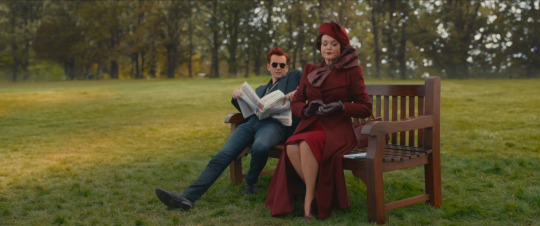
I have a lot of thoughts about how DIFFERENT this first meeting between Crowley and Shax feels, cinematically speaking...
Like, it just FEELS really weird, doesn't it?
Crowley's alone on some bench and gets a Typical Spy coming over and talking to him, then Shax right after. But something about the aggressive depth of field, the SUPER BRIGHT color grading, how we can see through Crowley's glasses with UNUSUAL ease, the weirdly central framing of the whole thing. Rainbow lens flares all over the place.
Feels weird. Something's off.
Big rainbow lens flare...
Lens flare frames Crowley in the shot even though that... doesn't make sense? I think?

Everyone in the shots for this scene are dressed VERY drably, in browns and blacks and greys, so with the color grading it makes Crowley REALLY stand out.
MANY of the shots are framed with a lot of space around them, as well, and it feels super fucking weird. Especially shots like this one, where there's a lot of dead space and just a SLOW ZOOM straight toward them.
"D'you ever think what's the point...?"
Very big dreamlike quality here, so I wonder. I wonder.
OR, it's highlighting the separation of Crowley from Hell. His jacket almost looks blue in these shots, especially compared to the vibrant reds Shax has on. It's quite stark, now that I notice it!

And then the next time she shows up, later the same day (allegedly!), like. I know it's afternoon or sundown but it still feels ABSURDLY different. Different camera work, much duller color, no weird filters or flares.

Anyway that's my brain dump for the day lol. Maybe in the first one, Crowley is dreaming but Shax can even show up there, y'know?
#good omens#good omens 2#crowley#shax#good omens meta#cinematography#or something#photography?#color grading#IneffabLeigh's Meta Tag
58 notes
·
View notes
Note

Thank youuuuuu 🥰
It means so much to me considering the hardships I had to went through to colour those dark as sh*t scenes ^^ (especially the thigh scene)
I swear those witches tested me but my love for lesbians won 🤣
You're welcome, dear 4alarmfirecracker. ❤️
"It means so much to me considering the hardships I had to went through to colour those dark as sh*t scenes"
Tell me about it!
I opened Photoshop, played with levels/curves etc. for a little while, got frustrated, gave up and simply waited for people who are good at Photoshop (or another software altogether) to work their magic.
Listen, all the 1.04 colorings I've seen so far are great, but when I stumbled upon yours, I was mindblown. Like the epitome of 🤯.
More evidence that gif makers are the mainstay of this hellsite.
Seriously though. When will artists and technicians understand that if we can suspend our disbelief about witches and vampires existing then we can suspend it for low light scenes as well?
In this particular case, I had to set the brightness slider to 100% and hurt my eyes just to be able to see that hug. Sheesh.
I'd say that was an artistic choice if I didn't know this is a general problem in our streaming era. Which is weird, because the budgets for TV series have skyrocketed and all of them have a more cinematic look nowadays.
This is why I feel that some artists are overconfident in their skills (they think they know their tools, i.e., cameras, LED lights, lenses, but they don't) and/or don't have much experience with night scenes. And, of course, they work under pressure and have rushed schedules thus this mess.
Counterexample? "Interview With The Vampire."
An amazing show for many reasons, but one of them is definitely this: even though most of its scenes take place at night--because it's a show about vampires, duh--there's light everywhere. The people behind it know how to separate the background from the foreground (there's a scene with Armand and Louis that takes my breath away because of this), their balance, exposure, color-grade scales etc. Everything looks great.
"I swear those witches tested me but my love for lesbians won 🤣"
And we are lucky it did! Kudos once again.
9 notes
·
View notes
Text

A Lovecraftian monster armchair, A comfortable armchair for a regular human, a chair made out of large old dusty bleached white dry bones, a chair made out of slimy tentacles, animal bones, translucent red jelly, moist human bones, red pour paint, natural aging damage and bone fracture implants as decorative elements, razor sharp animal teeth, broken bones, aged skin wrinkles, cracked bones, Gastropoda, carved bones, squid, jutting bones, octopus, Samurai costume styling, carved filigree, charcoal dust decoration, alien hieroglyphs, unidentifiable markings, insanely detailed, epic promotional composition, extra detail, award winning professional photography, an elaborate chair that looks like a robot and a sea creature, gothic rococo art by HR Giger and Beksinski, a chair in the style of robots from The Super Dimension Fortress Macross and Last Exile and Nausicaa and Akira and Metal Skin Panic and Appleseed and Patlabor and Robot Carnival and Royal Space Force and Votoms and Mospeada and Five Star Stories and Dragonar and Space Runaway Ideon and Transformers and Robotech, film photography color grading, Octane render, golden ratio, fibonacci, sacred geometry , enhanced tactile texture, Photoshop, Lightroom, dramatic lighting, cinematic lighting, cinematic quality, insane detail, Adobe Substance, zbrush, 35mm, f/2, Natural Lighting, Global Illumination, --v 5 --iw 1 --ar 4:5 --s 500 --c 20
@haveaseathuman prompt!
#midjorneyart#midjourney#midjourney v5#cosmic adventures#have a seat human#cosmic horror#horror armchair#ai art prompts
10 notes
·
View notes
Text
Ronald Knox -- Personal HCs
˗ˏˋ ★ ˎˊ˗ Specific things I give to Ronnie-Boy in my canon ˗ˏˋ ★ ˎˊ˗
✧ In life, Ronald was the eldest son of six kids, and grew up rather poor. His mother, Tweedie, tried to earn extra funds by having Ron deliver meat pies and bread to the working class.
✧ Ronald committed suicide when he was 22, by jumping from the roof of a factory. He got into legal trouble from gambling, and decided that taking his life would be much, much better than: Getting murdered, going to jail, or disappointing his mother. It was rash- He didn't think it through at ALL, and ended up regretting it right before he hit the ground. Adrenaline is a hell of a drug.
✧ Popular tumblr headcanon, but I'm a FULL supporter of the Knoxcliffe sibling agenda. Ron was Grell's first mentee!! He got to be the younger sibling for once, instead of the firstborn son that has to do everything to protect his family, no more 'man of the house'. Nah, he got trained by the biggest baddie around, and decided 'Man, this is nice, I'm going to annoy the shit out of her.'
✧ Graduated the Academy with decent grades, passed the Final Assessment with flying colors, and was So, So, So excited to finally be able to get his own, custom glasses. Ended up shaking Grell so much from excitement he fainted, and she had to drag him to Medical.
✧ While work is the main focus of his second chance at life, the reason he's so cheerful/prideful/arrogant (depending on who you ask) is because he finally gets to Live Life. No more worrying about if there's enough food on the table, no more worrying about helping to pay rent, no more avoiding simple things like going out, or avoiding buying nice things for himself!
✧ I think the reason he's a playboy is because he wants to experience Everything relationships have to offer before settling down. If he settles down. Ronald doesn't believe he'll settle down anytime soon, though. Give or take 300 years (or retirement!! whatever comes first--). Or, The One, but true love at first sight is ridiculous to him.
✧ His arrogance and pride are his biggest weaknesses. It was arrogance that got him into gambling debt, it was arrogance that got his ass kicked on the Campania, it was arrogance that got his ass kicked by a CHILD. He is talk shit while getting hit. Ronald doesn't know when to SHUT HIS MOUTH. Losing a fight, bloodied and beaten, but still managing a witty one-liner and a wink.
✧ Since reapers, in my canon, are at least 80 years to a century ahead technology wise- Ronald was immediately fascinated on what was possible. On how much more efficient things could be. This ended up with Ronald tinkering with mechanics a lot!! In my modern AUs, he's all 'high trends' and pop culture until you look at Bessie. A beat up, red(?) truck he doesn't want to scrap, so he constantly tinkers with it.
✧ The mower was his pick, solely because it's extremely efficient for collecting Cinematic Records. The blades spin fast enough to cycle through multiple at once, and since observing the records are just protocol at this point, he figured it'd be the best for avoiding OT. Oh, and he doesn't have to walk. The lawnmower was made to carry him. He cares for it 'Like his only child'- William and Grell tease him whenever it gets jammed.
✧ There's a fear of insects/arachnids somewhere. That's a secret surprise for later, though.
✧ Ronald is neurodivergent, we all accept this /j. BUT, in a more serious note, I think one of his specific tics is sharing food/lunches, solely because it's a 'safe' way of sharing affection with those he cares about. Grell makes sure to keep extra room on her tray for when Ron passes half a sandwich or dessert to her. On a rare occasion, and he will NEVER admit this, William let Ronald share a grapefruit during lunch. This was a big sign of trust for their friendship, since William is extremely specific about his lunches and can't let anyone touch them, and Ronald didn't know how exactly to show his feelings.
#ronald knox#kuroshitsuji#black butler#grim reaper#grim reaper dispatch#kuroshitsuji headcanons#black butler headcanons#cw sui mention
11 notes
·
View notes
Note
haven't seen it myself but please DO yap about the silly vampire movie !!
WELL I SUPPOSE THE PEOPLE HAVE SPOKEN LMAO
obvious disclaimer that this has nothing to do with fire emblem and also contains spoilers for the new nosferatu so if youre not into either of those then do keep scrolling
so im a big dracula guy right. i read bram stoker’s dracula for the first time in eighth grade for a project in my literature class and i fell SOOOO in love with it that it irreversibly changed my taste in vampire media. obviously growing up as a super lame goth kid in the 2010s means i got exposed to my fair share of the pretty type of vampire (think twilight). that type of vampire was (and still is) the more prominent one in media, and is the reason a lot of people perceive allure and charm as one of the central traits for vampires
BUUUUUUUUT dracula was my first interaction with the ugly type of vampire, and i found myself preferring those A TON. like, hot vampires are cool and all, but i still am drawn in so so so much more by the gross corpse-y vampire, and while i know that the 2024 nosferatu is a remake, it’s still one of the only examples of an ugly vampire in pop culture rn, AND I ATE THAT SHIT UPPPPPPP
i feel silly ranting abt the visuals in a movie without putting up screenshots of it to show my points but like. this movie still isn’t on my piracy site of choice in a quality that i wouldn’t be ashamed to post. so im just gonna rant and rave lol. many talented gif creators on here have the visuals for what im talking abt lol they’re out there if you rlly want them.
THIS IS SUCH A BEAUTIFUL MOVIE GUYS. im a sucker for stuff with super artsy shot composition, and so many shots in this movie literally look like they could be paintings. in fact, im literally gonna do paintings of a few of them when i can access it in a nicer quality. the usage of color and shape is also super awesome, they have that twilight-y blue color grading happening but in a way that actually looks rlly nice instead of making you question why everything looks so blue lol. that gets contrasted with a lot of REALLY REALLY WARM shots and that choice probably has some type of symbolism to it, i’ve only seen this movie once over winter break so i might watch it again and make a more detailed rant specifically about the usage of color to communicate the narrative, lmk if that’s smth you’d be interested in lol.
DONT HATE ME BUT THIS MOVIE WAS ALSO REALLY FUNNY LMAO. like it’s objectively so silly. the way herr knock fucking scurries around biting pigeon heads off????? GOLD ACTUAL GOLD. the way that thomas is such a little baby bitch the whole time????? stunning. the way that count orlock threw those little girls back like a frat boy chugs a beer??????? cinematic history was made. it’s such a beautiful movie but GOD its stupid. i’ve been eating up all the memes about it online it’s been a fun time. shoutout to ugly vampires.
6 notes
·
View notes
Text

Cinematic Photography in Hong Kong: Tips & Secret Locations 👉 https://bysumex.com/cinematic-photography-in-hong-kong-tips-secret-locations/
Hong Kong is a city where neon lights, towering skyscrapers, and narrow alleys create the perfect backdrop for cinematic photography. Whether you’re aiming for a Blade Runner-esque aesthetic or a moody, film noir vibe, here’s how to capture the city in all its cinematic glory.
5 Tips for Capturing Cinematic Photos in Hong Kong:
Master the Light: Hong Kong comes alive at night, with neon signs and ambient street lights casting dramatic shadows. Shoot during the golden hour or at night to make the most of these moody contrasts.
Pro Tip: Use the natural haze from humidity or rain to diffuse light for a dreamlike effect.
Frame for Depth & Layers: Use leading lines like tram tracks, alleyways, and footbridges to add depth to your images. The city's overlapping structures create endless layers of visual interest.
Pro Tip: Shoot from a low angle to emphasize scale or capture reflections from puddles for added dimension.
Focus on Storytelling: Cinematic photography isn’t just about beautiful compositions—tell a story. Capture fleeting moments like locals rushing through markets or a quiet scene in a bustling café.
Color Grading is Key: To achieve that "cinematic" look, post-process with muted tones or specific color palettes like teal and orange, which enhance the contrast between warm and cool tones.
Pro Tip: Experiment with film emulation presets to mimic the look of classic cinema.
Use Wide Lenses: The city’s dense urban environment lends itself to wide shots. Capture the juxtaposition of old vs. new Hong Kong—traditional markets beneath ultra-modern towers.
Secret Locations for Cinematic Shots:
Mong Kok Night Markets: The vibrant chaos of Mong Kok is perfect for gritty, neon-lit street scenes. Capture vendors, neon reflections, and bustling crowds.
Yick Cheong Building (The Monster Building): For iconic symmetrical architecture shots, head to this densely packed residential block in Quarry Bay. Its dramatic structure feels straight out of a sci-fi film.
Temple Street Night Market: This famous market in Jordan has an atmosphere that's gritty yet vibrant, ideal for capturing authentic local life under a sea of neon.
Chungking Mansions: This gritty labyrinth of cultures is like stepping into a different world. Its narrow corridors and dim lighting provide an atmospheric backdrop for moody shots.
The Star Ferry: A trip across Victoria Harbour offers a stunning view of Hong Kong’s skyline. Capture the interplay of light reflecting off the water at sunset or during the blue hour.
Central’s Mid-Levels Escalator: The world's longest outdoor escalator system offers a unique perspective for dynamic street shots. Try shooting the escalator as it disappears into the bustling streets below.
Bonus Tip: Bring a tripod for long exposure shots, especially when shooting Hong Kong's busy streets or capturing light trails from cars and trams.
Hong Kong's cinematic potential is endless—experiment with angles, moods, and styles to discover your own unique take on this visually stunning city
#hk #hongkong #cinematic
2 notes
·
View notes
Text
Fujifilm XH2s Anamorphic Short Film in Cinematic 4K/6K
Had a chance to film with the Fujifilm XH2s the other day. Now I wouldn’t say there’s an “obsession” with the anamorphic look, more like a raging fascination with the aesthetics – Here’s the result of the combo: Get a special 10% discount at dehancer.com using the code: BOZ10 Color grading using a combination of LUTs byBoz™️ and Dehancer OFX plugin in DaVinci Resolve. The flog 2 footage held…
View On WordPress
#anamorphic#blackmagic braw to rec709 luts#cinematic film look#color grade luts#Color Grading DaVinci Resolve#Color Grading Tutorial#DaVinci Resolve Tutorial#Dehancer Film Emulation#Dehancer Tutorial#Film Look Color Grading#film look on digital camera#fujifilm#Fujifilm XH2s#Short Film
0 notes
Text
CapCut Pro APK: Unlocking Advanced Video Editing Features
In the realm of mobile video editing, CapCut has emerged as a favorite among creators, thanks to its user-friendly interface and robust features. While the standard version offers a wide array of tools, the CapCut Pro APK takes the experience to the next level, providing advanced functionalities that cater to serious content creators.
What is CapCut?
CapCut is a free video editing app developed by ByteDance, the same company behind TikTok. It allows users to create and edit videos seamlessly, offering tools like trimming, merging, adding effects, and overlays. The app's intuitive design makes it accessible for beginners while still powerful enough for seasoned editors.
Features of CapCut Pro APK
Enhanced Editing Tools: The Pro version offers additional editing features such as advanced color grading, multi-layer editing, and precision trimming, allowing for greater creativity and control over the final product.
Exclusive Effects and Filters: CapCut Pro APK provides access to a broader selection of effects and filters that are not available in the free version. This includes cinematic transitions, glitch effects, and customizable templates that can elevate your videos.
High-Quality Exports: Users can export their projects in higher resolutions, including 4K, ensuring that videos maintain their quality across different platforms.
No Watermark: One of the significant advantages of the Pro version is the removal of watermarks from exported videos, which is particularly beneficial for creators looking to maintain a professional appearance.
Advanced Audio Editing: CapCut Pro includes enhanced audio tools, allowing users to adjust sound levels, add voiceovers, and utilize a library of royalty-free music.
Collaboration Features: The Pro APK allows for easier collaboration with other creators, enabling multiple users to work on the same project and share edits seamlessly.
How to Download CapCut Pro APK
Downloading the CapCut Pro APK involves a few simple steps:
Enable Unknown Sources: Before downloading, ensure your device allows installations from unknown sources. This can typically be found in your device's security settings.
Find a Reliable Source: Search for a trustworthy website that hosts the CapCut Pro APK. Always check reviews and ratings to avoid malware.
Download and Install: Once you’ve found a reliable source, download the APK file and install it on your device. Follow the on-screen instructions to complete the installation.
Launch and Explore: After installation, open the app, and you’ll have access to all the advanced features CapCut Pro has to offer.
Conclusion
CapCut Pro APK is an excellent choice for anyone looking to elevate their video editing skills on a mobile device. With its extensive range of features, it caters to both casual users and professional content creators. Whether you're creating content for social media, YouTube, or personal projects, CapCut Pro can help bring your vision to life. Just remember to download it from a trusted source to ensure a safe and seamless editing experience.
2 notes
·
View notes
Text
after color correcting a lot of OFMD footage, a very funny thing i've noticed is like. they've color-graded it to be. brown.
like, if you've ever seen a video on youtube where an old painting is restored, the conservationist always has to remove an old layer of varnish because it's yellowed over time, and this varnish casts a very noticeable sheen over an artwork
in season 1 this "antique" effect is used as a form of deliberate color grading, and it actually doesn't look too bad most of the time as a cinematic choice
but it IS still there. which means i have to scrape off some of that artificial patina
now. where it gets weird, though.... is season 2.
i've talked about it. i've posted videos about it. but season 2 does this thing where they attempt to go for this antique look again
which. first of all. feels very weird thematically. i'd argue that the purpose of this color grading in season 1 was to enhance the romanticism. this unrealistic idea stede has about piracy. it's very dream-like. season 2 is more like: this is reality. it's harsh. but i digress
so they slap this brown filter on. but they like. really crank up the opacity on that badboy. to the point where it drowns out the original color of the shots. that color information is completely destroyed.
and then, to make it worse, because season 2 is more Gritty, they then darkened all of the shots as well.
so you have a thick brown filter, you take away the lights... you've got sludge. you've got tar.
and this made me so sad that i literally taught myself new editing skills to get rid of it.
i never felt that way with season 1. even in areas that are very heavily color graded (like interior shots, due to candle light), because you can still fucking. see
regardless of however i feel about like. wardrobe. pacing. characterization. of this season. and if my feelings of those things will change over time
i will never. ever. forgive the person in charge who decided to do this to the color and lighting. it benefits precisely no one. your final product looks bad for casual viewers and you make it harder for those of us who make content promoting your show FOR FREE by making it so that we have extra hurdles to climb over every time we make a gif, post a screenshot, or make a video
hbo max i am in your walls.
#i recognize too that my own colorgrading isnt perfect bc. your girlboy has a macbook#which means i deal with that dreaded quicktime gamma thing#so i preemptly correct for it prior to export (and so it will hopefully look somewhat close to normal on iphones)#**preemptively#and sometimes the stuff comes out a little dark bc of it#i can't think abt digital color for too long it stresses me out
7 notes
·
View notes
Note
hi i just wanted to ask if you could go more in depth about your creative process? how much work goes into lykaia and making content for other things like your logo etc. im making sims content too and i want to improve on it and make my stuff more original. so people know its me when i post. and i also wanted to say i saw you say before about not stepping on other creators toes and as a small creator i really appreciate that because i feel like a lot of people don’t make space for other people. sometimes everything feels like a competition in the sims community and that’s why other creators don’t like to give credit to people they actually get influenced by because they don’t want their numbers to grow only they own. And most time i don’t even want to post because of that
Hmmm. I’ll talk about my creative process for sure. I like talking about my creative process lol. It’s gonna be long tho so.. you asked for it.
Background: Lykaia at its core is just a cinematic version of my gameplay save. I had a story in my head while I played their household, but it was never fully planned out. The first season of Lykaia was just me practicing with storytelling and machinima making. I didn’t really have any direction. I just made things up as I went. Lou’s friends never existed in my gameplay save. I just made them for the machinima. A lot of it was just finding my footing as I went. What the story has become now, I never planned. It sorta just happened. As it is now, Lykaia’s a fully planned out series with a brittle back bone lol. It’s a whole lot of making something out of nothing.
Planning the Series & Making It: So, I have a full outline for the season. Where I want to go and how that can be developed on further. From that, I plan out the episodes. Right now I have a week where I film and a week off from filming. On my off week, I write the script. Scene by scene. I storyboard it to visualize how I want each scene to look. Once the script is done after a draft or two, then I start setting for filming. I get everyone dressed, moved into the households, and get the sets built. On the week I film, I just go in and film. I try to go in order of scenes but sometimes I jump around. Especially if I’m excited to film a scene. I do about two scenes a day. They take about an hour or so to film each. (I’ve got a full time job, a fur baby to care for, my family, and my social life so my time to work on it is limited. I try to budget it wisely.) Then I usually edit while I’m in bed or cooking. I edit on my phone so I’m not carrying around my pc lol. Editing takes the longest and it’s the most tedious part. I go in and add in the into, outro, title card, then I add in the scenes and the breaks. If I have to overlay something then I do that before audio. And the. I color grade each scene individually. Last thing to do is audio. I hate audio. I break it up scene by scene and mix some of the music myself depending on the episode. Once I do a quick check, the episode is done and ready to export. Sometimes I pick the title beforehand, but I usually don’t come up with a name until after the full episode is done.
The Brand: Ophernelia and Kiricheu are a brand. (Ophernelia being like the parent company in a sense) Especially Ophernelia since I have a Patreon for it. I run Ophernelia as a sole proprietor, so branding is important for me. Anything I have my hand in, I take seriously. (“It’s just sims content” Sure. For now at least. Doesn’t mean ima take it any less seriously lol) Especially since I’ve curated an audience and one that pays. Idc if it’s $2. It’s money spent, so I want my audience to get quality content. Branding’s been tough because I’m super indecisive lol. I like to change things up constantly but when it comes to like a company type of thing, you shouldn’t really do that. Which is why I hate changing mine. Especially once I find something that works. It makes me feel like I’m failing my audience by not being consistent. As of now though, I love my branding. I feel like it reflects my content style really well. It took a few tries to make. I looked through old art I’ve done and tried to combine it with my current style. Somehow I came up with how it looks currently. I think it’s pretty, I wanna stick with it. It took a while to get here, but 8 months later, here we are. I’ve been trying to rely a little less on external programs (like canva) and more on me actually making my stuff myself. So I hopped into procreate and got to work lol.
Ultimately, I just make stuff I like and sometimes I like to share it with other people. And when I do share it, I try to do it to the best of my ability and while trying to be mindful of others. It’s hard and idk if I do it well but I’m trying! The process of getting there is almost always enjoyable. Almost lol.
4 notes
·
View notes
Text
Aftersun
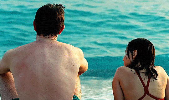
What a way to make my life more depressing!
Haha jk.
This film !! Never fails to give me goosebumps everytime I recall the happy moments between Sophie and her dad. And when the ending came, I kinda got lost for a moment, I felt so empty and scared I wanted to cry so hard. I realized, aside from movies where an animal dies, I can never watch films that involve father and daughter/son relationship, like this one does. Yeah, I think this is gonna be the last time because I don’t know know when will I be ready for stuff like this again, or if I’m ever going to be ready at all.
Can’t tell that much about the plot/storyline except that it was really successful in capturing nostalgia and melancholia. This film is not about telling a story, it’s about the feeling you get everytime you revisit important memories from the past, it’s simply just an emotion heavy film. The memories of Sophie with her dad, Calum, during their vacation in Turkey just feel so warm to watch. There were bright and happy times, but there were also dark and helpless times—especially for Calum.
Right, now giving the spotlight to the actors because they were just SO good. The kid, Frankie Corio, aside from the fact that she’s such a pretty girl, I thought that she did really great in portraying her character, and the way she delivered her line? Very precise with the tone. Which is why I think she’s really cool for that. And of course, the Paul Mescal. I’ve seen him before from Normal People (and this reminds again me that I haven’t finished that one yet!), you would definitely see how versatile he is as an actor. Paul’s just really good at showing his emotions through his eyes. He doesn’t even have to try hard in acting, he’s effortlessly good at doing his job and I think he’s so cool for that too.
P.S. Since this is a film from the Great Britain, i already expected that the accent would be really strong on this one, especially the characters are coming from Scotland where the accent is just beautifully strong. So I made sure I watch with the subtitles on. I’m happy that I did and that the (illegal) site where I watched it have them too. Was able to clearly hear and understand what the people on that film were saying because listening to them speak without the subs feels like I’m having auditory dyslexia (jk just made that up but that’s really how I can best describe it). No offense scottish people!
REMINDER: Never be ashamed of watching an English-language film still with the subtitles on!
Finally—and I will never shut up about this category, the cinematography. I love it so much. It was realistic and very subtle at the same time. Turkey was also beautiful as it is. Color grading’s fantastic too, I love how bright and clear the colors are in this film. I just didn’t like the rave part where there were flashing lights. It hurt my eyes for real I had to look away from the screen everytime that scene showed up. Other than that, I really love the cinematic feel of it.
Final Verdict: 8/10
5 notes
·
View notes
Video
vimeo
16mm Film Overlay Effect Motion Design from Antony Parker on Vimeo.
✔️ Get it here: templatesbravo.com/vh/item/16mm-film-overlay-effect/56574045
16mm Film Overlay Effect | After Effects Template
16mm Film Overlay Effect is a fully customizable drag-and-drop effect for After Effects 2024 and above. This template accurately replicates the look of vintage 16mm film, adding cinematic grain, subtle frame jitter, noise, and characteristic color grading. With built-in customization options, you can fine-tune every aspect of the effect to match your creative vision.
The overlay supports classic 16mm aspect ratio ([information on project page]:1), Super 16mm format ([information on project page]:1), and fully adjustable custom framing. You can enable or disable film borders, apply black-and-white grading, or turn off frame movement for a cleaner look. The auto-resizable feature ensures seamless compatibility with all resolutions and aspec
0 notes
Text
Unlocking the Power of Adobe After Effects: A Creative's Dream Tool
Adobe After Effects is a game-changer for designers, animators, and video editors. This software opens up a world of possibilities for visual effects (VFX) and motion graphics, empowering creatives to bring their ideas to life in stunning, cinematic ways. Whether you're working on a Hollywood blockbuster, a YouTube tutorial, or an artistic project, After Effects is the perfect tool to enhance your content. Let’s dive into its many features and see how it can elevate your creativity.
What Makes Adobe After Effects Stand Out?
Adobe After Effects stands as the industry standard when it comes to creating motion graphics, VFX, and compositing. Its versatility and wide range of tools make it a go-to software for anyone looking to push the boundaries of visual storytelling. After Effects is designed for professionals and newcomers alike, offering intuitive interfaces and advanced capabilities to cater to all skill levels.
Powerful Motion Graphics
After Effects is known for its ability to create stunning motion graphics. Whether you’re animating text, graphics, or illustrations, the possibilities are endless. With powerful features like keyframing, easing, and path animation, you can easily control the movement and style of elements. It’s the perfect platform to design dynamic and eye-catching animations.
Advanced Visual Effects (VFX)
For those working with video, After Effects excels in adding breathtaking visual effects. Whether you're creating explosions, integrating CGI elements, or enhancing color grading, After Effects provides the necessary tools to make your footage look professional. It supports 3D compositing, chroma keying (green screen), and advanced tracking, all crucial for seamless VFX work.
Seamless Integration with Other Adobe Products
One of the strongest features of Adobe After Effects is its smooth integration with other Adobe Creative Cloud tools like Adobe Premiere Pro, Photoshop, and Illustrator. This interconnectivity ensures that your workflow remains efficient. You can easily import assets from Photoshop or Illustrator, and the round-trip workflow with Premiere Pro allows for seamless video editing, giving you a cohesive creative process.
Why Adobe After Effects is Essential for Creators
Enhance Your Videos with Stunning Animations
For video creators, After Effects is essential for creating engaging animations. Whether you're designing intros, lower thirds, transitions, or visual storytelling elements, After Effects makes it easy to take your videos to the next level. Its powerful tools allow you to manipulate and animate objects with precision, creating content that stands out.
Create Professional-Grade VFX
With After Effects, you can turn your footage into something extraordinary. Advanced features like 3D camera tracking and particle simulations allow you to add realistic effects that blend perfectly with your video. Whether you’re working on sci-fi, fantasy, or dramatic sequences, After Effects makes it possible to achieve stunning results.
Edit and Composite Like a Pro
After Effects is not just for animators; it’s also a powerful compositing tool. You can layer multiple video clips, apply masks, and create complex composites that blend perfectly with each other. For professional video editors, After Effects provides the tools needed to fine-tune every detail, making your video look polished and seamless.
Getting Started with Adobe After Effects
Easy-to-Learn for Beginners
While After Effects offers a range of complex features, it is also beginner-friendly. Adobe offers a wealth of tutorials, templates, and resources to help you get started. The software’s interface is intuitive, allowing you to quickly learn the basics and gradually explore more advanced techniques as you gain experience.
Expansive Community and Resources
After Effects has a vast community of users, which means a wealth of tutorials, forums, and plug-ins are available to help you learn and grow as a creative. Whether you need advice on a specific effect or want to learn how to speed up your workflow, you’ll find resources and support within the After Effects community.
0 notes